Under 8 months of operating the new e-shop was enough to pay for 7,000 hours of our work
Before the redesign, the Nazuby.cz e-shop ranked among the top 20% best-performing e-shops worldwide according to metrics published by Wordstream.com. It was therefore absolutely essential to eliminate the risks associated with replacing the old website with a new one.


5 e-shops, 1 platform
The redesign did not only concern the Nazuby.cz e-shop, but an entire family of e-shops focused on dental hygiene, shaving and (de)epilation:
- Nazuby.cz
- Nazuby.eu
- Holime.cz
- Holime.eu
- Dentmania.de
The key and also the oldest e-shop is Nazuby.cz. However, the other stores are by no means just padding. All e-shops use the same website in terms of design and technology, differing only in content depending on the product range and target country.
Redesign towards sustainability
The original website had already undergone incremental improvements that gradually increased metrics such as speed, conversion performance and traffic. However, it was created at a time when mobile devices did not play a significant role, and therefore used only a fixed layout.
After initial analyses with the client, we identified several problems that had to be addressed during implementation:
- Without a transition to a responsive website, the site’s performance would begin to stagnate and eventually decline.
- The front-end of the original website was good and fast, but after initial analyses it was clear that it could not be effectively used for a responsive website.
- The client’s e-shop product range is sold by a huge variety of stores, from pharmacies to drugstores, and the product offering is also incomprehensible for a layperson.
- Virtually anyone connected to the internet could be a relevant customer, which is over 80% of the population in the Czech Republic alone.
„One example of the breadth of the product range that speaks for itself: an electric toothbrush from common brands can cost CZK 100 or CZK 11,000.“
Project goals
Based on the client’s motivations and the current state, we defined the main project goals:
- improve website performance (sales metrics), especially on mobile devices,
- deliver a responsive version of the website and improve user experience across all devices,
- prepare an environment for better content management and better targeting of marketing communications,
- create a technologically sustainable platform ready for easier development of the entire family of e‑shops.
„We were worried not only that people wouldn’t like the website or wouldn’t know how to use it, but also about the technological transition – that Google would stop liking us.“

Jan Stejskal
Managing Director, Nazuby.cz
Minimum-risk solution
The only limitation of the final solution was that it had to be a website/e-shop again, as it is the client’s primary and only sales channel.
„More than 30 rounds of quantitative tests and 5 questionnaire surveys with over 1,200 respondents“
We therefore built the strategy for achieving the project goals on:
- Thorough analysis of existing data – competitor analyses, keyword analyses, heatmaps and scrollmaps from Hotjar, user data from Google Analytics, and business data from the e-shop databases.
- Broad user research – in the first phase, qualitative research in the form of in-depth interviews gave us design hypotheses (e.g. how people choose dental hygiene products). We then validated these with a sociologist from Masaryk University through 5 quantitative questionnaire surveys with over 1,200 respondents.
- Intensive testing at all stages of design and implementation – we repeatedly tested information architecture and prototypes; we validated the visual style with emotion tests; and we used preference, five-second and question tests for testing graphic designs. We also tested a graphic prototype with real content and the finished website before launch. In total, more than 30 rounds of quantitative tests were conducted.

Design principles
Based on data analysis and user research, we arrived at several key findings on which we built our design decisions:
- We optimised category pages, product pages and the checkout process so that 80–90% of users could see key elements above the fold.
- Users are affected by significant choice paralysis in most product categories. In the new design, we therefore focused on:
- content strategy – editorial reviews, video tutorials, “how to choose” articles and similar,
- information architecture that, through its structure, category naming and brief explanations of individual categories in navigation hubs, helps users choose products,
- verified tips for those who don’t want to choose – the usefulness of these product tips is confirmed in every user test and in campaign data,
- and tools for narrowing down the selection – extensive filtering options, product comparisons and alternative categorisations in some main categories.


Navigation hubs, filtering and product comparison
- Users are very conservative about the layout and content of typical e-shop pages. An example is the banner below the e-shop header, for which heatmap and Google Analytics data suggested it was unnecessary for users. We focused on this hypothesis during testing and found that people did not understand they were on the e-shop homepage because it did not match their expectations. We found more such cases. The result is that the layout and content are very conservative.
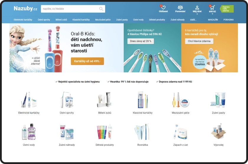
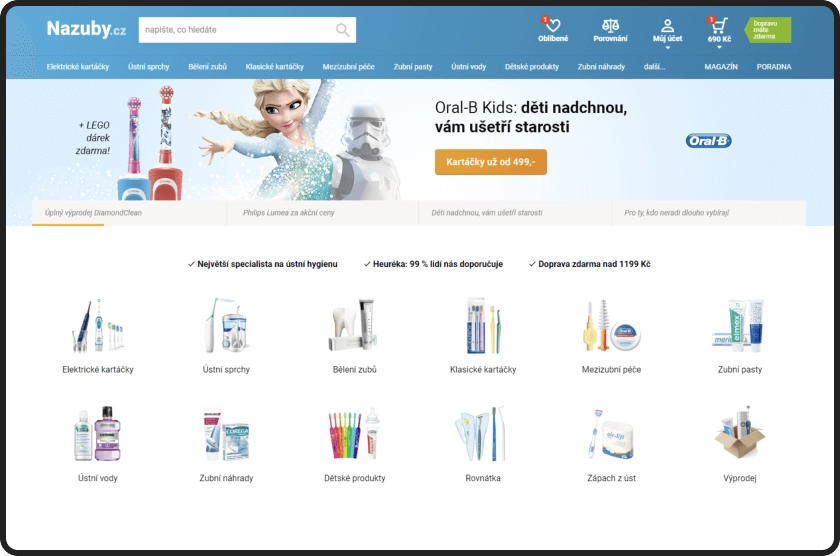
A/B testing of banner variants on the launched homepage
- Users are sensitive to font size and element contrast not only on mobile, but also on desktop. Higher-contrast and perceptually larger versions of the graphic design appeared clearer and more trustworthy to users during testing. These conclusions are also confirmed by user testing of the live website. Paradoxically, this view is not limited to older users (45+), but also younger users aged 25–35.

Results of the redesign? Increased conversion rate, revenue and profit, with payback in months
We compare actual sales data from the internal e-shop database and Google Analytics data from Nazuby.cz, Nazuby.eu, Holime.cz and Holime.eu for the period:
- Before redesignNovember–May, 2018/2019
- After redesignNovember–May, 2019/2020
„We were worried not only that people wouldn’t like the website or wouldn’t know how to use it, but also about the technological transition – that Google would stop liking us.“
Jan Stejskal
Managing Director, Nazuby.cz
+33%
Increase in average conversion rate by 33%. Specifically +32% on mobile and +38% on desktop.
+27%
Increase in revenue by 27%. Revenue increased by 37% on Nazuby.cz and by 49% on Nazuby.eu.
+40%
Increase in profit by 40%. Of that, 24% from the redesign alone, after adjusting for natural growth and other factors.
8 months
8 months of e-shop operation was enough to pay for 7,000 hours of our work. After adjusting for natural profit growth.
„I would never recommend a complete redesign to those who don’t have to do it. But when it’s unavoidable and the only solution, it can truly be done in a controlled, high-quality way with excellent ROI.“

Jan Junek
Lead designer of the Nazuby.cz project, Proof & Reason
The e-shop has also been recognised by national competition juries

Interview: Winning project in the Most Effective Web Development 2020 category at WebTop100
Watch the interview with Nazuby.cz co-founder Jan Stejskal, project lead designer Jan Junek and Proof & Reason CEO Tomáš Izák on the occasion of winning the WebTop100 2022 competition.
Tomáš Izák, Jan Junek, Jan Stejskal
Interview about the Nazuby.cz redesign

Optimisation? Redesign? Simpler system for partners? Digital transformation?
Let's discuss what you're currently facing
Don't want to wait? Call +420 604 122 182 or email tomas.izak@proofreason.com

Tomáš Izák
CEO