
Using specific examples, we will explore several points from the book 100 Things Every Designer Needs to Know About People, which will help you guide users through your website all the way to a successful conversion.
1. People cannot maintain attention for long
Every piece of content that appears on your page increases cognitive load. But human mental capacity is limited — the higher the load, the less able we are to think rationally and make good decisions.
Take a look at the following example from the website of the Czech Ministry of Health. Imagine you want to find out more about an upcoming smoking ban in restaurants. How long would it take you to find your bearings on a page like this?
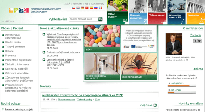
Yes, the site is cluttered with various elements, multiple types of menus, news items, tiles, photos, icons and updates,… It assumes that the information the user is looking for is important enough to warrant a thorough search. That said, even such websites can be done well, as we wrote in our article 10 Ways to Design Services the British Way.
2. People are lazy — they only do what is absolutely necessary
Don't expect people to read every word you write. In reality, they read just enough to feel satisfied. In practice, this means they scan visually prominent elements and only actually read when the content genuinely interests them.
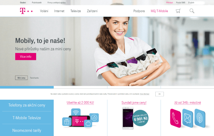
Look at the following example. All texts on the page are simple and short — there is no need to dig for hidden meaning, so users only expand the content they came for.
3. People do not see everything on the page
Watch the following video, where Daniel Simons and Christopher Chabris tested selective attention. Count how many times the people in white pass the ball to each other.
By the way, did you notice the gorilla? This test shows that we often miss even very prominent elements and changes in our field of view. This is called selective attention — we only pay attention to what we want to. So let us not assume that website visitors will see everything we put on a page. Focus only on what truly matters.
4. The most captivating things are faces, stories, movement, food and sex
Use these with care. There is no point forcing any of them into a website at all costs. For typical microsites, the practically useful ones are primarily stories and faces.
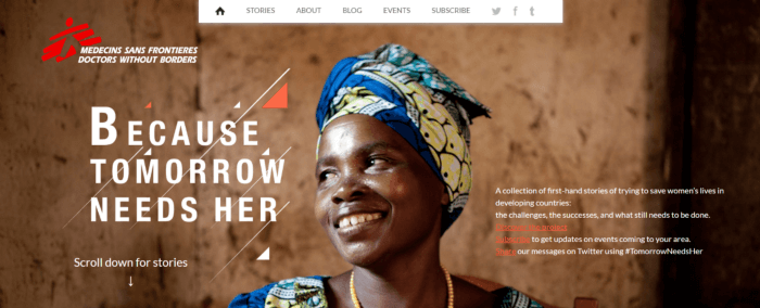
There is one important nuance with faces: we look where the figure in the image is looking. This can be used effectively when designing a page.
5. People browse websites based on past experience
Over more than two decades of the internet, we have learned that website layout follows certain patterns and conventions — the logo is in the top left, navigation is on the left or at the top, and so on. We carry these learned principles to any new website we visit — we expect it to “work” in a similar way.
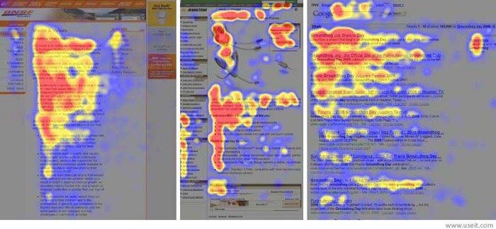
Jakob Nielsen (www.nngroup.com) conducted an extensive study tracking where website visitors’ eyes move. He found that eyes follow the lines of the letter F (the so-called F-pattern): they prioritise the top left, scan content row by row, and always jump further down at the end. The lower down the page a person is, the less they care about content on the right. That is why CTA buttons should never be placed in the bottom right corner.
6. People remember clusters of numbers better
Try looking at the following phone numbers:
- 724459415
- 72445 9415
- 724 459 415
Which one is easiest to remember?
For both short-term and long-term memory, the more things we have to remember, the less successful we are. This applies not only to number sequences but also to the information on your website. That is why it makes no sense to bombard visitors with countless reasons to do what you want — it is better to carefully select the 3–4 best ones and give them space. They will do a better job.
7. People are more motivated when they are close to the goal
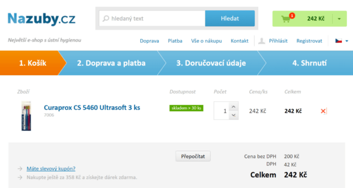
And most of all when the goal is within reach. Willingness to keep clicking increases significantly when we can almost grasp why we are doing all this. And if the goal is not within reach, it helps to at least make it clear that progress has already been made and the goal is getting closer.
Help your users with a progress bar showing the steps still ahead of them. People find it much more pleasant to know that only a few simple steps remain before reaching the goal.
8. When people are unsure, they let others decide for them
We tend to seek out what others think of our decisions. This is the principle behind all user reviews, testimonials (statements from satisfied customers) and ratings — for example on e-shops.
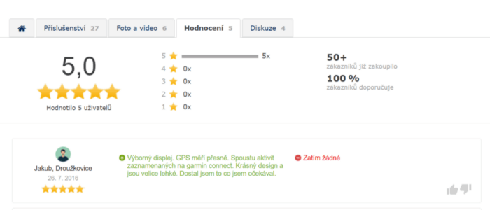
An equally important aspect is that reviews, testimonials, awards and ratings significantly increase trustworthiness — and therefore the willingness to take a desired action.
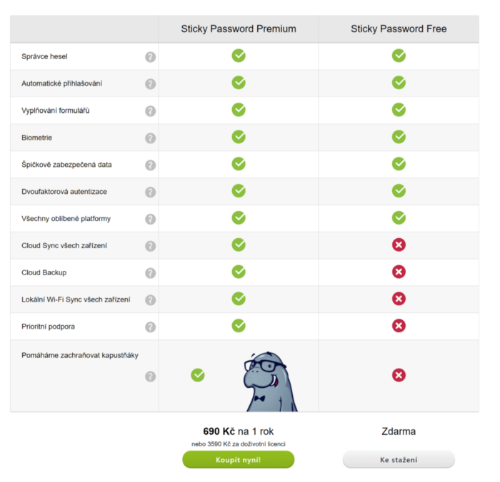
9. People need to feel they can choose and are in control
That is why it is good to give them options. Like Sticky Password does. You can either have the free version, or the version where you are a hero saving manatees.
10. People make mistakes
But if you design your website well, they will make fewer of them. A few tips on how to handle errors:
- expect that something will always go wrong
- communicate clearly what happened (at the point where it happened)
- explain why it happened
- offer a solution
Simply do not leave them stranded. If users get confused on your website, there is very little chance they will complete the conversion action they came for.
And that is it. Simple, right?
What is the takeaway? Remove all obstacles that stand in the way of conversion — along with everything that is not absolutely necessary. This not only makes it easier for people to navigate, but also allows you to gently guide them in the direction you want them to go.
Article by: Jan Junek