
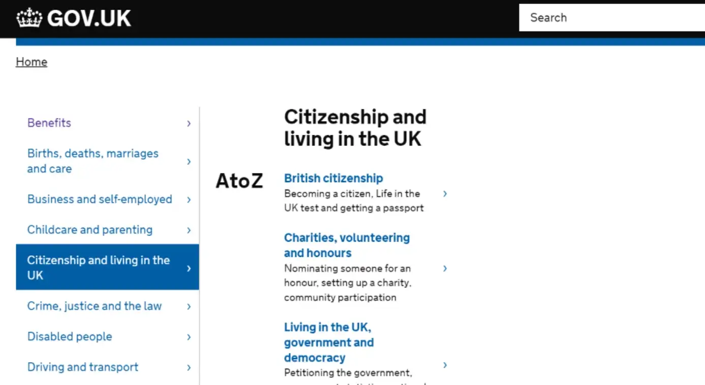
We're talking about the portal that consolidates information from four hundred government agencies and institutions: the British GOV.UK, which replaced the original Direct.gov a few years ago.
Caroline Jarret from GDS (Government Digital Service) is responsible for surveys and questionnaires on GOV.UK. At this year's Libdesign conference, she presented 10 principles her organisation follows when designing the portal. These allow them to build a website that is clear and understandable for an incredible mass of people.
- Start with user needs — a hundred times told, right? But it's the most important rule. Never build something just to have it — build it because it helps someone.
- Less is more — have you seen what Direct.gov looked like in 2012? And what GOV.UK looks like in 2016? Which one do you find clearer?
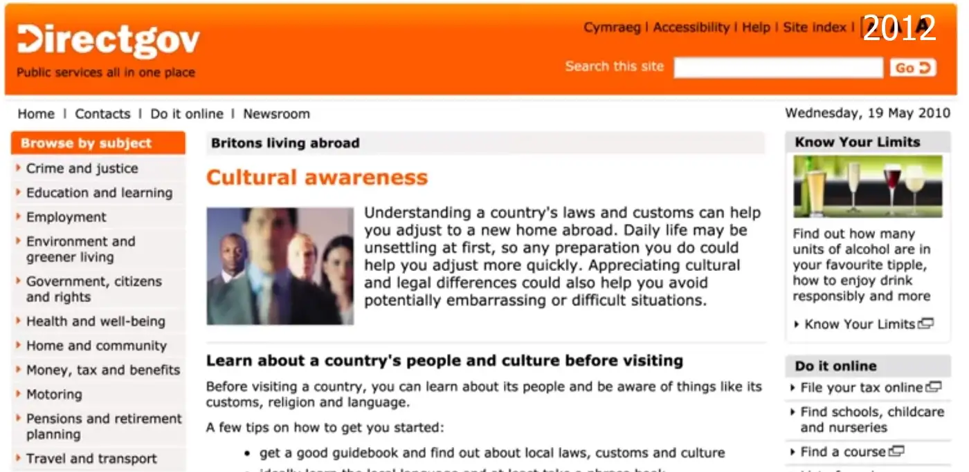
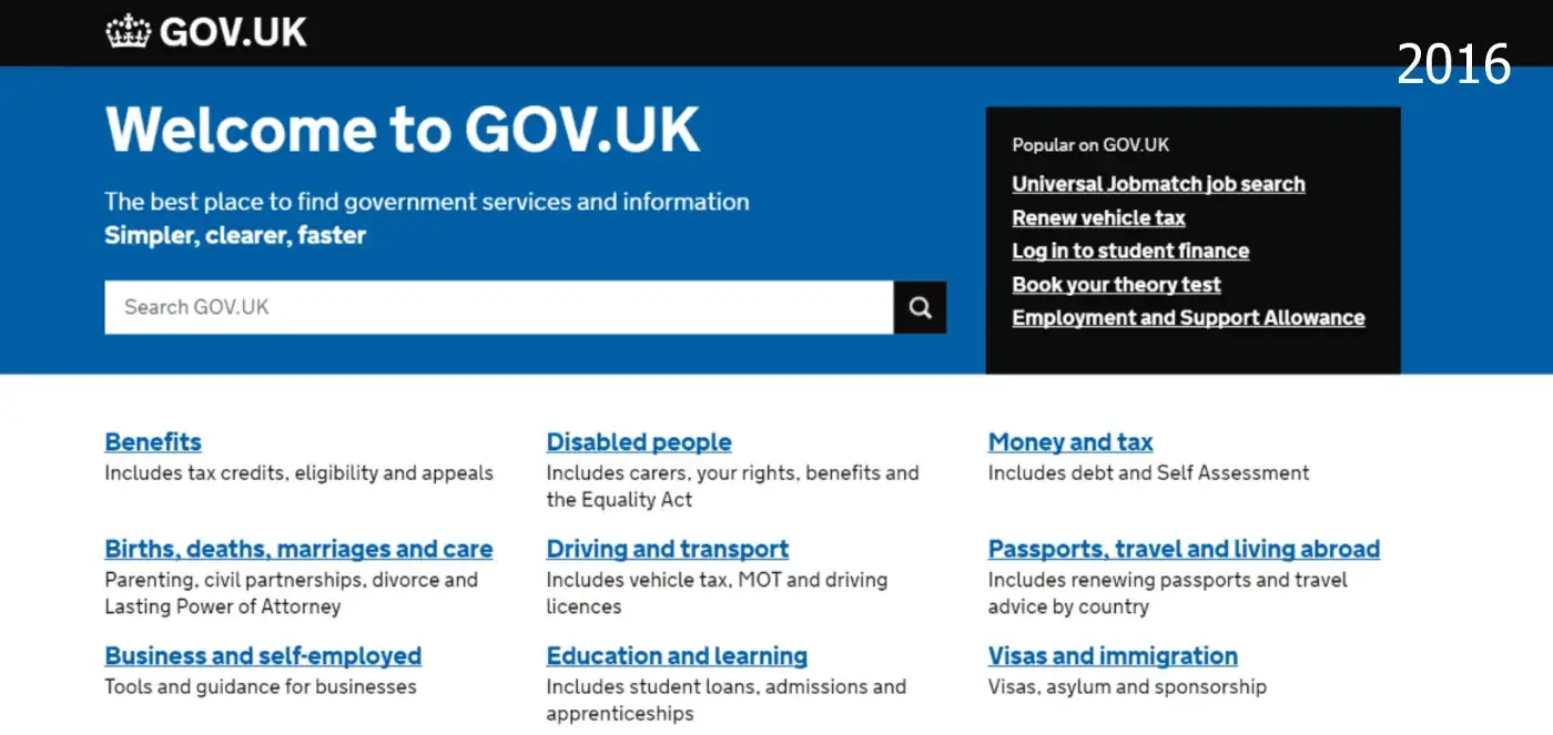
- Design with data — and not just that: keep coming back to it, verify it, and compare it to the current state.
- Do the hard work to make it simple — … and definitely our philosophy should be on there. And photos of everyone on the team. And all our products on the front page. And login. And logout. And FAQ and a Pinterest button. And a map. And everything. For GOV.UK, this means clear access to information from 399 ministries, agencies, and institutions.
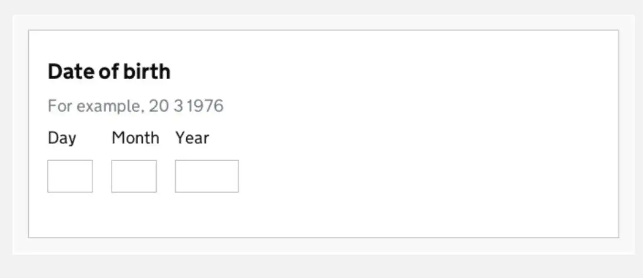
- Test. Then test again — your website may also be visited by people with very limited computer literacy. Sometimes you have to test for a very long time to create a form this simple. At GDS, testing revealed that a dropdown listing all dates and years can be a literally unsolvable problem for less experienced users.
- Think for everyone — GOV.UK is visited by British people. But also Czechs, Germans, Turks, Pakistanis, Georgians, Poles, Kenyans, teachers, bricklayers, taxi drivers, seniors, the visually impaired, and a diverse mix of users. That's why it's necessary (much like when hiking in the mountains with a group) to think about the needs of even the least capable user.
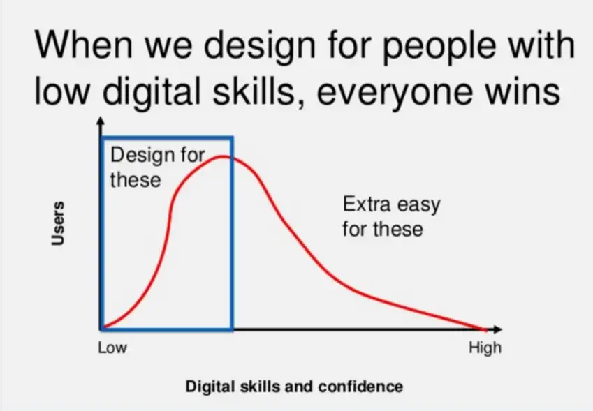
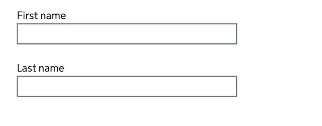
- Be influenced by your surroundings — do you have a critic who finds fault with everything on your website or service? Congratulations — listen carefully to their complaints. Whatever the comment, it's usually worth addressing. You might discover there are users you can help by changing something tiny. For example, adding borders to certain elements can help people with low vision navigate the page more easily.

- Build digital services, not websites — According to Caroline Jarret, GOV.UK is very much aware that they exist to fulfil the needs of citizens, not the needs of government and agencies. In the Czech Republic, this awareness is beginning to emerge, for example at the Ministry of Labour and Social Affairs in its efforts to simplify and make ESF grants accessible. It's a shame that similar innovations haven't yet reached other ministries — such as the Ministry of Education.
- Be consistent, not rigid — a persistent trend is the urge to overwhelm website visitors or service users with precise, specific, and comprehensive information. In the case of government agencies and institutions, this often results in something like: In accordance with Act on the Provision of Such and Such Things § 168/21 Sb. as amended by subsequent legislation, we hereby notify you that detailed information on the status of social insurance contributions as of the given date may be obtained at the website of the Ministry of Labour and Social Affairs in the Contact section, where you will find contact details for the respective assigned offices. However, it's important to realise that unifying and simplifying the website journey doesn't mean that even the most serious and austere organisation necessarily has to resort to jargon.
- Don't hide your work, you'll get better solutions — and finally, perhaps the best takeaway from this article: blog.gov.uk
On this extensive blog divided into 101 sub-topics, you can get a behind-the-scenes look at what goes on behind the GOV.UK portal. Very interesting articles can be found, for example, in the User Research section.
„We don't do what's popular, we do what's important."