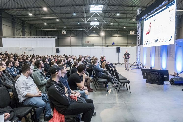
This question was explored at the Czech Online Expo conference by Jan Junek, our UX design specialist at Proof & Reason.
An outdated website outearns the competition
In the image you can see the website of a password management application. Its competitors have modern, clean website designs, while this one looks rather dated — large text, contrasting colours and an older smartphone model. You would probably assume this is not what a successful website looks like.
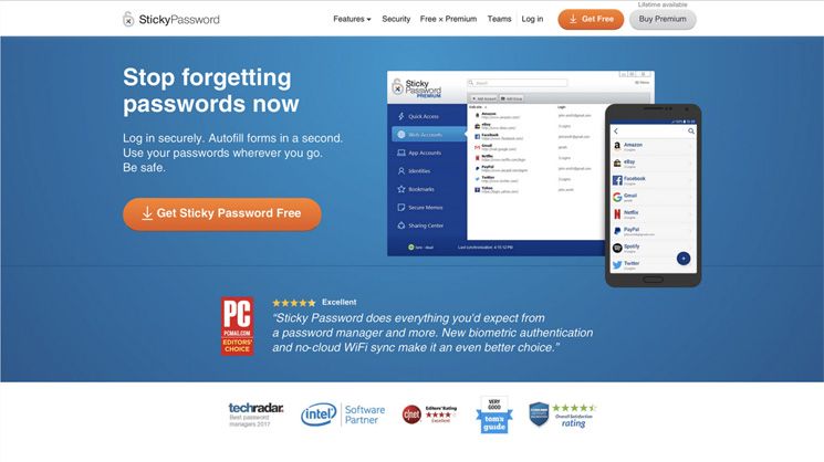
That is why you will be surprised to learn that after launching what some might consider an outdated design:
- the bounce rate dropped by 14%,
- the number of software downloads increased by 56% and purchases by 38%,
- the revenue and profit of the page increased,
- the conversion rate improved by 21%.
At one point, the company had a marketing budget 100 times smaller than its roughly thirty competitors, yet ranked among the top 5 sellers of this type of application. The key to success lies in understanding the customer.
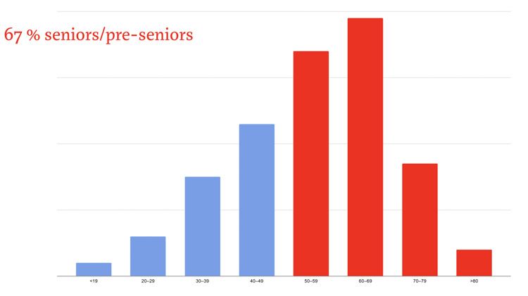
In the American market, password managers are most commonly used by seniors. Typically these are people who are somewhat sceptical of modern technology, have had bad experiences with the online world, and tend to trust things that feel more familiar — reminiscent of an era they were more comfortable with.
Assumptions differ from reality
That was just one of the examples from Jan’s talk. And it illustrates well why outdated websites that no designer would put in their portfolio can be successful and profitable.
The general assumption is that a website should look good because:
- people prefer appearance and attractive design,
- the website is easy to use, because it is easier to navigate,
- so people visit and use it more, leading to higher conversions,
- and therefore greater profits.
But data from global research and our own projects tells a different story:
- website preference does not depend on looks, but on usefulness and how easily a customer can make a purchase,
- a more attractive design often does not mean a more functional design that makes navigating the site easier,
- similarly, conversions do not depend on the site’s beauty, but on how easily customers can find what they are looking for and want to buy,
- so it is also not true that a beautiful website earns more money.
Ordinary customers do not focus on design
When creating websites, both clients and designers often get carried away by illusions. Instead of thinking about the customer, they think about whether they personally like the site and whether it follows trends. But data and research cited in the talk suggest, for example, that:
- customers are not interested in design trends,
- overly beautiful things come across as advertising, so they trust them less,
- they prefer what they know and feel comfortable with.
That is why instead of major overhauls and rolling out a brand-new layout, we recommend making small, gradual changes so that customers can adjust more easily.
Find out what your customers need
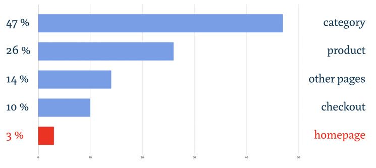
If you want your website to fulfil its purpose and goals, it does not need to be beautiful. The homepage is typically what graphic designers showcase in their portfolios, yet according to data the most common entry page on a website is the product page.
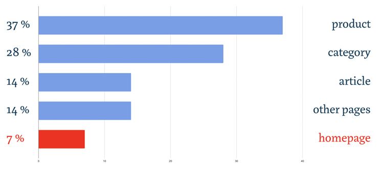
Similarly, based on time spent on individual pages, the homepage is the least important part of a website. Far more important are product pages and the clarity of the purchase process from adding to cart to placing an order.
To create a functional website, analyse and research primarily the behaviour of your customers:
- what environment they inhabit and how they function in the online world,
- which websites they encounter and which e-shops they shop on,
- which websites they are used to,
- what their limitations are — if you are targeting older users, for example, account for impaired vision and the need for larger text.
Once the website is ready, test it thoroughly and find out how target users actually interact with it.
Want to learn more?
Jan’s talk covered a wealth of information and interesting data and sources. If the topic caught your interest, you can read more about design and website performance in these articles on:
- appearance and usability of websites,
- major changes and redesign,
- or how to shed assumptions when building websites.
If you missed the talk or want a refresher:
- browse through the slides from the Czech Online Expo presentation from February 2022,
- watch the recording of the latest version of the talk from Czech Online Expo 2022,
- or watch the talk from WebExpo from 2019.